|
How you can get the most from printing
on metallic media:
We’ve put together some hints and tips on getting the most out of printing on metallic card stock.
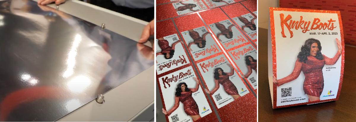
TIP 1: HARNESS WHITE INK
To harness the full effect of the gold or silver base, print areas that are not to be metallic with a base of opaque white ink. Indicate this area on your art with a layer showing where the white ink should be applied. This will allow light to reflect off the metallic base and through the transparent inks to mimic a foil effect.
TIP 2: CHOOSE SHINY SUBJECTS
Consider using images containing water, metal, or reflective subjects – whether cars, jewelry, or architecture. The metallic base enhances the imagery bringing it to life.
TIP 3: ALLOW TIME FOR EXPERIMENTATION
Remember that metallic paper doesn’t work for everything, but don’t be afraid to experiment. Saturated colors, contrasty monochrome, and pastel scenes can shine on this paper. Allow time to run a test print or two to ensure you get the effect you are looking for.
|