|
🔁 Consistency Is Your Best Friend
When you use the correct logos consistently across all your materials - from your website to your business cards to your facility signage - you're doing more than just displaying a graphic. You're reinforcing your commitment to sustainability and quality with every customer interaction. This repetition helps potential clients remember your certification, associate it with your brand, and understand its value. Over time, consistently using R2 logos alongside your own branding becomes a shorthand for trust and quality, making it easier for customers to choose your services over non-certified competitors.
💎 Quality Matters
Using high-quality logos and imagery makes you look more professional than those who don’t. The high-resolution images provided by your CB and SERI ensure every mark and logo is crisp, clear, and easily readable, whether it's on a giant trade show banner or a tiny email signature. By consistently using high-quality images, you're showing attention to detail and reinforcing the idea that your commitment to quality extends to every aspect of your business, from your recycling practices to your marketing materials.
🧭 Context is Crucial
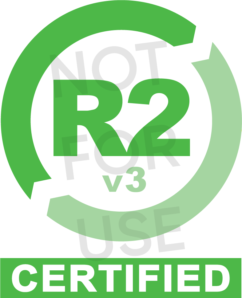
Understanding when to use each R2 logo is like choosing the right tool for the job – it's essential for effective communication. The R2v3 Certification Mark, R2v3 logo, and base R2 logo each serve different purposes and convey distinct messages. Using the right logo in the right context demonstrates your understanding of the certification and prevents confusion. For instance, use your R2v3 Certification Mark in promotional materials to showcase your certified status, and the base R2 logo in thought leadership content to demonstrate your industry knowledge without overstating your credentials. By selecting the appropriate logo for each situation, you guarantee your message is clear, accurate, and impactful.
📐 Respect the Guidelines
Think of the R2 logo guidelines as your secret weapon for maximum impact. These aren't random rules but tried-and-true tips to make your certification stand out. Stick to recommended sizes to keep your logo crisp and clear, from business cards to billboards, and use official colors to create a unified, trustworthy look. It isn't about being picky – it's about presenting a professional image that resonates with potential clients. Strategic logo placement is also essential to catching people's attention without overshadowing your company's identity. By following these guidelines, you're effectively amplifying your R2 certification in a crowded marketplace.
|