|
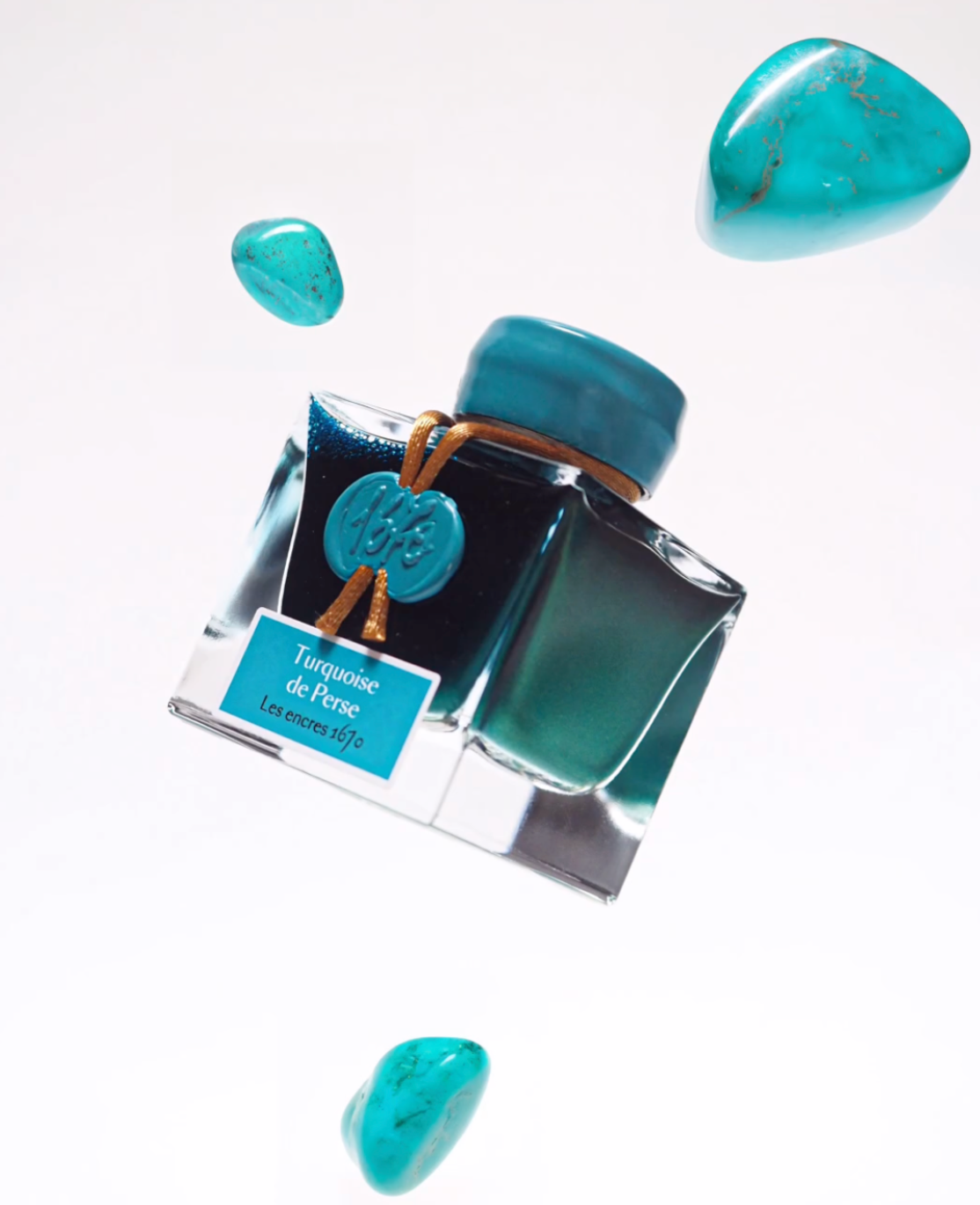
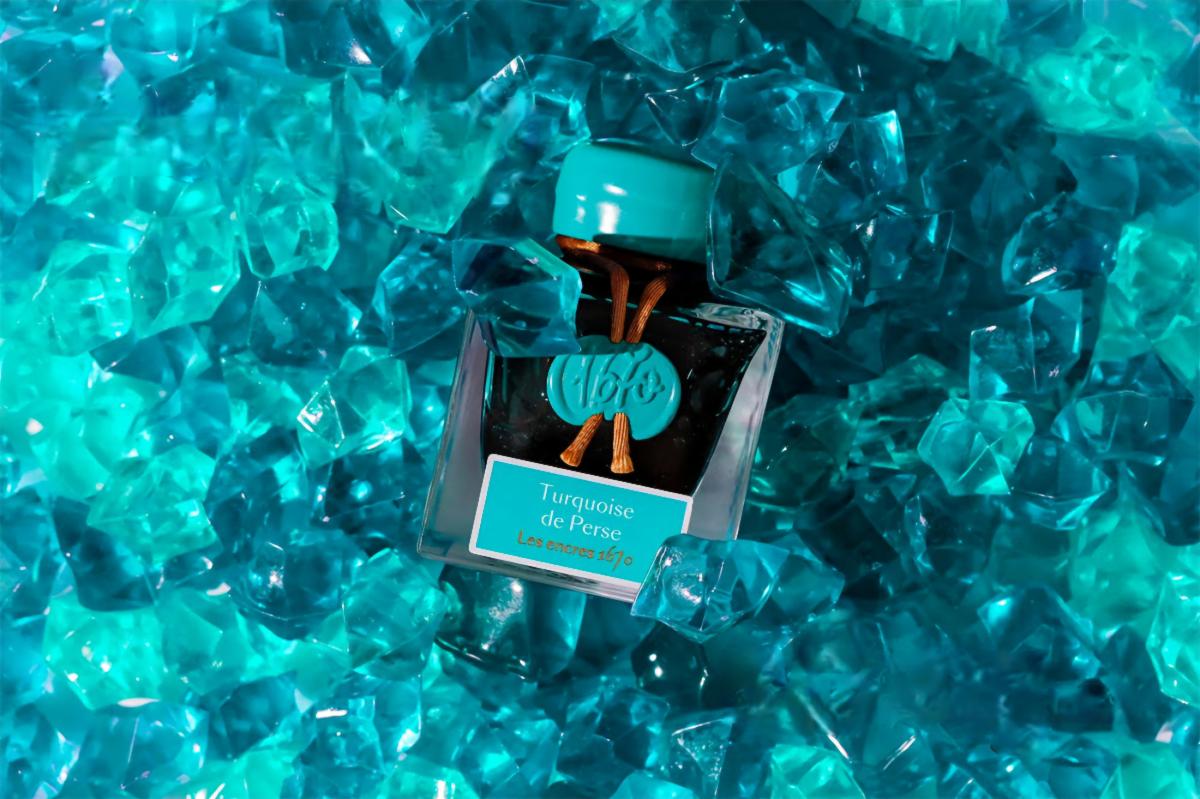
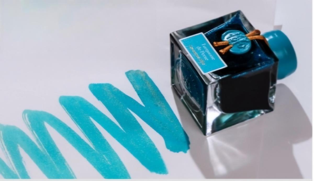
Turquoise is such a fascinating color. Whether you enjoy seeing this lighter blue color in your pens or inks, turquoise is mesmerizing. You can get lost in its depths. And considering so many things are made with turquoise as a color option (even outside of the pen community), it’s no surprise when we get even more options to use turquoise. In this case, J. Herbin brings a new color with the J. Herbin 1670 Turquoise De Perse Bottled Ink.
First of all, J. Herbin's 1670 inks commemorate the year that the Jacques Herbin company was founded in the heart of Paris. This year’s addition to the 1670 Collection is Turquoise de Perse. Notably, the J. Herbin 1670 Turquoise De Perse Bottled Ink is inspired by the blue-green tones of genuine turquoise.
This is an excerpt from today's blog. For those of you who missed it, check out the rest of Adam's blog review of the J. Herbin 1670 Turquoise De Perse Bottled Ink here.
Do you like what you’re reading? Subscribe to our blog! Don’t forget to comment and share on social media! What are some of the things you’d like to see reviewed?
|